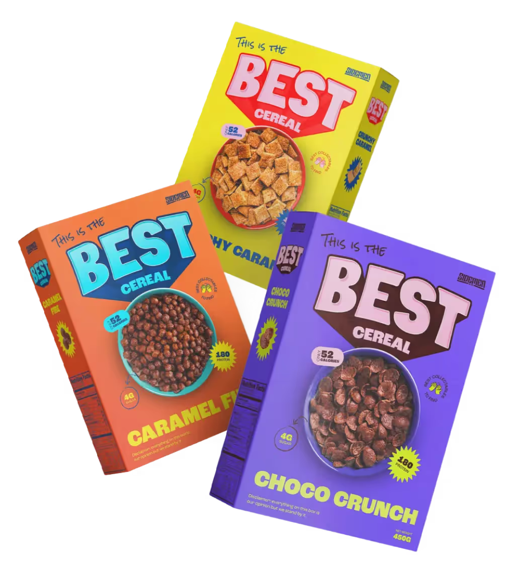
Working with the amazing team at Arcade media, we designed and engineered this super clean and very fun one pager for the launch of the Sidemen breakfast cereal. The theme is bright and bold and the site is packed with engaging interactions and moments of joy as the user scrolls through the offering. Leveraging GSAP animation, Spline 3d and designed and built in Webflow, we were able to turn this around in less than 2 weeks to meet a very tight deadline and didn't compromise anywhere.

The client wanted to highlight the product line in a new and interesting way so we decided to showcase the 2 flavours in full bleed, colourful sections and include custom built 3d interactive boxes the user can interact with and spin to see the product in all its glory.

We spent a good deal of the short timeframe we had incorporating SEO best practises as the brand name was difficult to rank for on Google, we leveraged Schema and also keywords strategically dotted through the fairly minimal UI in order to make sure customers searching for the product could find it easily and it worked as we see great organic traffic and top-of-page ranking.

